

adoption ☘ affiliate (affie) ☘ best viewed ☘ binky beads ☘ blinky ☘ cam ☘ clique ☘ codes ☘ currently ☘ divider ☘ doll ☘ frames ☘ hostess ☘ hotlinking ☘ kaoani ☘ layouts ☘ link exchange ☘ listed ☘ materials ☘ me/you/site ☘ neopets ☘ php ☘ pixel friends ☘ pixels ☘ pop-up ☘ quilting bee (q*bee) ☘ sozai ☘ sprite ☘ splash page ☘ table layouts ☘ tumblr ☘ wall of shame ☘ webmistress ☘ webring


adoption ☘ an adoption is a type of pixel trading and link exchange. a site offering adoptions would create a set of related pixels, often animals or small objects, and display them as being available for adoption.

adoptable pony pixels as seen on ready for rainbows, 2003 (via wayback machine)
pixel "parents" could adopt a pixel of their choosing by displaying it on their site along with a link back to the pixel's creator. in some cases, a pixel could only be adopted by one person, in which case the exchange occurred by email or a web form. adopted pixels often appeared on the home page, splash page, or in a dedicated "toybox" area as shown below.
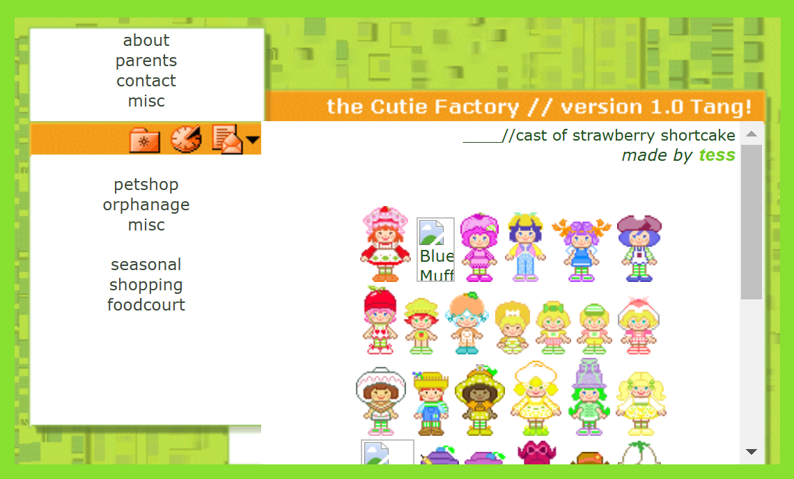
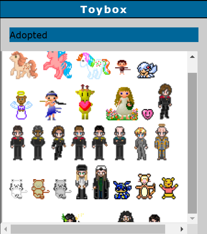
(1): evastars cites the cutie factory among their inspirations, 2003 (via wayback machine) (2): an adoptions "toybox" on cathie's crazie creations shows an eclectic mix of pixels representing my little pony, star trek, jay and silent bob, and winnie the pooh, 2003 (via wayback machine)
affiliate (affie) ☘ broadly speaking, affiliate links are links shared as part of a pay-per-click scheme. however, among webmistresses in the 2000s, affiliates or "affies" were sites that had agreed to free and mutual button link exchanges. (an analogous term in the modern day might be "mutuals.") affies would typically interact over email to express interest and then exchange patch-size buttons (32x32). these affie patches were typically displayed in the "site" portion of a me/you/site or directly on the homepage.

sweet skittles affies page, 2006 (via Wayback Machine)
best viewed ☘ on the splash page of a me/you/site, a line of text describing preferred device prerequisites would typically appear beneath the "enter" graphic.
It's this simple...
. 1024x768 or higher. IE .PNG . tables . div . enter .
binky beads ☘ binky beads were created by
midgee/namaii in 2001 and were popular among me/you/site webmistresses of the early 2000s, including
evastars. the binky beads site allowed visitors to string together pixel beads, each a 10-pixel square, to
spell out words, names, or create other designs as virtual "bracelets." binky beads could be used for splash
pages, as navigational elements, or even inline with text, like this:  . from the homepage of binky beads:
welcome to planet binkytopia, the third version of this site. i started making these because i was feeling nostalgic and was overcome with the urge to make some of those plastic pony bead bracelets that say things, but i had no such beads and no money to acquire them. the few i made initially got me hooked and i've now ended up with an entire alphabet, animals, happy faces, leopard skins and every color of the rainbow, including of course, the rainbow. please feel free to use them but make sure you read the rules first and consult the faq if you have any questions. enjoy!

the binky beads site has been migrated from its original url (binkybeads.tk) and is now accessible at namaii.com/binkybeads, with the last update listed as 2004. however, the bead vault is not accessible, and most links now redirect to paid neopets affiliate links.
blinky ☘ a blinky is a type of animated gif frequently used to showcase an individual's interests or style.
"What is a blinky, you ask? It's basically the WWW equivalent of a bumper sticker. Pick one or two to slap on your homepage to tell the world what you're into. Don't overdo it, though. You don't need a blinky that says "I love CHOCOLATE." Everyone loves chocolate. Plus, if you have 8,247 blinkies, people will prolly start to think you're a certified wack-o ^__^ ehehe" —yaxa (2002)
animation was typically limited to flashing letters or borders, giving the look of an animated marquee sign. on the web broadly, 150 x 20 was a common size for blinkies, which were typically shown on myspace pages and in forum signatures.


me/you/site webmistresses tended toward a smaller standard size of 88 x 15, which allowed two stacked blinkies to have the same dimensions as a standard 88 x 31 link button.


there were even more diminuative blinky sizes ranging from 11 to 6 pixels high.


the aesthetics of 15-pixel and 9-pixel blinkies more closely matched the me/you/site art style and tended toward usage of the style's standard pixel fonts such as bangalore and redensek.
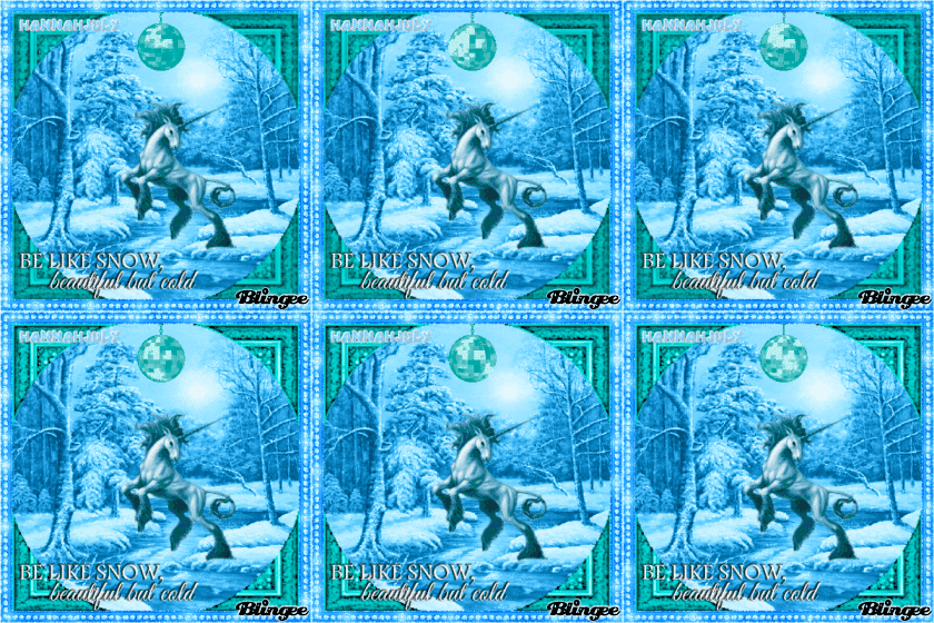
the direct descendent of the blinky was the blingee, another form of personalized, flashing gif popular in the late 2000s and revived in the 2010s by popular demand.
cam ☘ in this context, "cam" refers to still images captured with a 2000s-era digital camera. while the terms "cam" and "camgirl" today connote sexual content, cams shared on me/you/sites were not necessarily sexual. within in me/you/site scene, they were typically innocuous photos of one self at the computer or of the computer desk. the closest modern analog to this use of the word "cam" would be "selfie."
in an effort to respect privacy, we have intentionally excluded historical examples of cams.
clique ☘ a clique is an exclusive form of listing similar to a webring in which sites apply for membership and, if awarded, are able to display a blinky or text link back to the clique's homepage.
cliques typically had their own sites, which included a description of the clique, rules, a form to apply, and a list of members.
cliques distinguished themselves from webrings by being more exclusive, whereas webring membership had little bar and in some cases was automated to accept all applicants. there were also so-called "elite cliques," which were meant to convey additional selectivity among members. clique graphics, if any, were typically no more than 15 pixels high, and their codes typically did not include direct links to other members.
the differences between cliques, listings, webrings, and other forms of link exchange are nuanced and in some cases trivial. this description from pick me! (2004, via wayback machine) illustrates how similar the categories were, even at the time.
cliques: sites with memberships of people/sites of common interest/s.
webrings: a ring of sites with memberships of people/sites of common interest/s.
listings: webdirectory sites/lists.
rotations: button/banner/text rotations
exchanges: button/banner/text exchanges
fanListings: fan lists are sites with memberships of people with a particular interest in a star/musical group etc.
perfection was a popular clique, though it rejected the label of clique and instead considered itself an "elite listing." like many cliques of its era, being a hostess or hosted was a baseline requirement.
Must own webspace/domain or be hosted at someone else's domain. This means angelfire, tripod, geocities, freeservers, expage, brinkster, or any other free websites are not permitted. A simple rule: If your site is not good enough to be hosted elsewhere, it is not good enough to be listed in Perfection. I know that sounds very rude, but if you are truly talented, someone will host you. I promise! —perfection (2004, via wayback machine)
codes ☘ in the context of the me/you/site, codes referred to html snippets provided on a site with the expectation that visitors would copy and paste the snippet their site. codes were generally for link exchanges, cliques, or fanlistings. in some cases, applicants needed to incorporate membership codes before being accepted into a clique or fanlisting. in other cases, codes could only be used by those already accepted.
currently ☘ the "currently" section was a common feature in the homepage of a me/you/site. it would list what the webmistress was currently eating, watching on tv, etc.

examples of currently sections from four different sites, 2002-2006 via wayback machine
divider ☘ a graphic used as a divider between sections, such as the flowers on this page. while dividers were not limited to the me/you/site, they were commonly provided on sites offering sozai.
doll ☘ a doll is a class of pixel that resembles a fashion doll, often in the style of early Bratz dolls or other dolls of the 2000s. doll subculture was adjacent to the me/you/site, but there was some overlap in girly aesthetics, pixel art skills, and pixel trading.
hostess ☘ most young html enthusiasts of the 90s and 00s created free sites on hosting services like geocities and tripod. webmistresses sought to distinguish themselves and demonstrate their technical knowledge by creating sites on self-hosted web servers with custom domain names.
in reality, not all webmistresses had the knowledge and money needed to set up a server and custom domain. this created an economy around hosting, where one girl, the "hostess," would set up custom hosting and a domain, then award subdomains to a handful of applicants, the "hosted". those who were chosen to be hosted would receive their own ftp accounts and a reserved amount of bandwidth/disk space. for example, if someone named mimi applied to be hosted by cuuutie.net, the hostess would check mimi's existing site for quality and, if approved, award her the subdomain mimi.cuuutie.net or cuuutie.net/mimi.
hostesses did not charge their hostees and typically only required some form of link exchange. however, like much of me/you/site, the process of applying for hosting was accompanied by long lists of requirements, rules, and exclusivity. the hostess of kawaiiness.com (via wayback machine) shared these requirements in 2004:
basic requirements
- html/graphics skills that are pleasing to my standards
- at least 3 examples of your work. (sites, graphics etc.) Impress me. ;)
- hosting experience, including knowledge of ftp, scripts (if using them), etc.
- friendly and non-teenybopperish and non-camgirl.
- readable english. nOt TaLkiNG LiKe tHiS. OR likz this!!! omgz!
special req. @ kawaiiness
interested in hosting cute, pixel or visitor based content/cliques/adoption sites. hosting on kawaiiness is extremely exclusive as I have a limited amount of space and bandwidth. Thus, I will not like to host any png-intensive sites. If you will like me to host a scans site. Please link them off to free servers. :)
what will be included
despite the high requirements that I expect for my sites, I'll definitely provide what you need once I accept your application. what you will get in return, is around 5 to 10 mb of space for starters, but this amount can be increased if you need more; a subdomain, ftp, mysql, php, cgi. script installations that come with fantastico are also provided. you will also be able to contact your *cough* friendly hostess, moi, through aim, msn or email.
hosting served as a status symbol associated with web expertise and talent. most cliques only accepted hosted sites. some webmistresses even extended these rules to affiliates.
No FREE sites!!! I only accept domains and hosted people. Exceptions for old affies and close friends ONLY. —honey-babe.net (2007, via wayback machine)
hotlinking ☘ hotlinking was the practice of displaying an image on one site that was hosted on another site without permission. while a trivial practice today, in the 2000s, image hotlinking stole bandwidth from the person hosting the image, which could degrade their hosting service or incur additional charges.


(1): hotlinking protection for oh-bebe.net (2005, via wayback machine) (2): graphic for my little pony hotlinking/image stealing vigilante group pain (ponies against image nabbing)
materials ☘ pixels created for some functional purpose in web design were referred to as materials, goodies, or sozai. see sozai for more in-depth information.
me/you/site ☘ the me/you/site is a genre of website created primarily by girls and young women (self-described "webmistresses") in the early 2000s. me/you/site refers to the three content areas found on these sites: autobiographical content ("me"), web tutorials or content such as adoptables or sozai offered to visitors ("you"), and meta-content ("site"). these sections were often literally titled "me," "you," and "site," though variations such as "the girl / the goods / the www" were also common.
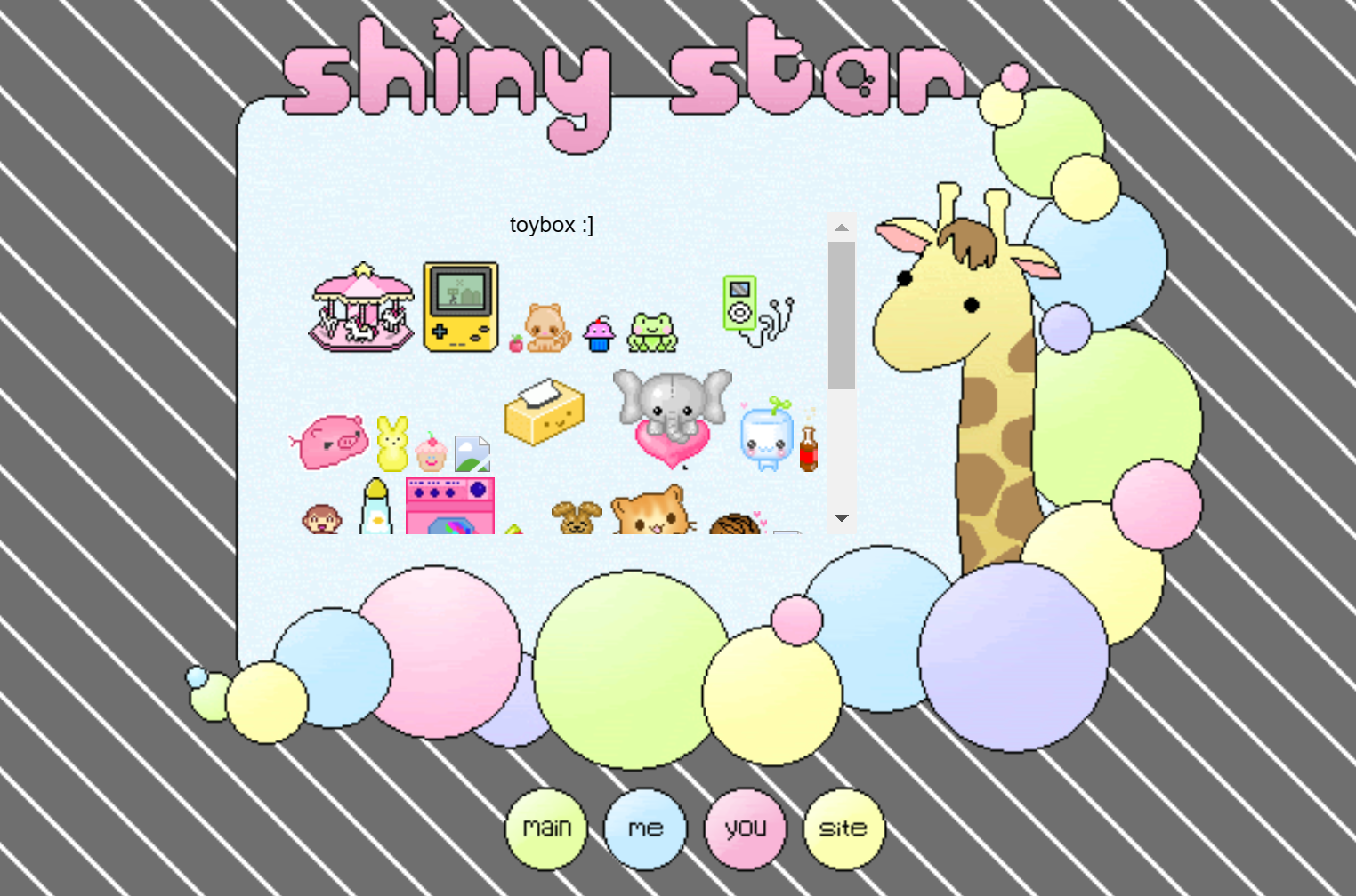
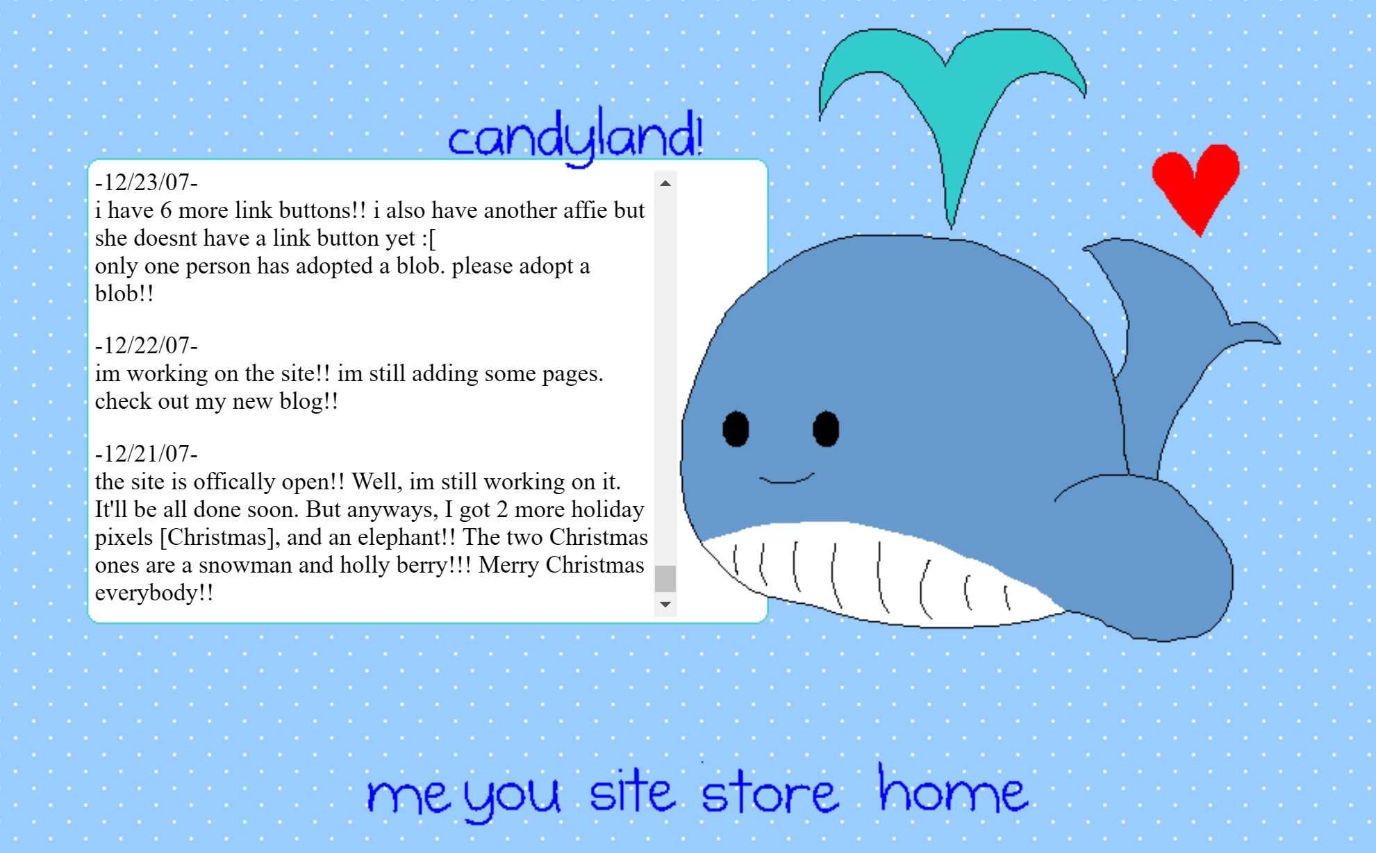
(1): shiny star (2008, via wayback machine) (2): candyland (2007, via wayback machine)
content found in the "site" sections might include clique or fanlisting memberships. another common element of the "site" section, which was somewhat unique to this girls' subculture, was an archive of previous layouts. this archive was a timeline that often included descriptions and screenshots of previous layouts. this allowed webmistresses to document their skills in web design in an informal resume of sorts.
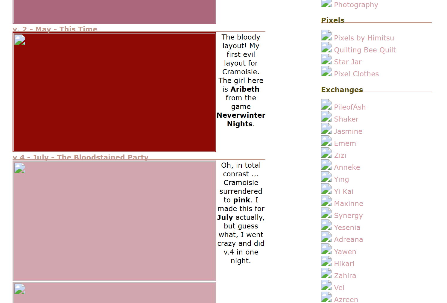
an archive of past layouts on cramoise (2005, via wayback machine)
sozai ☘ pixels created for some functional purpose in web design were referred to as materials, goodies, or sozai. in a website using a me/you/site format, sozai were found in the "you" section.
sozai (素材, lit. "raw materials") were created with the purpose of helping others build websites. as such, they often came in numerous color-coordinated sets and provided functional ui. examples include dividers, bullets, and common navigation icons like "home," "back," "top," and "email." blank buttons were also provided to allow the user to add their own text.
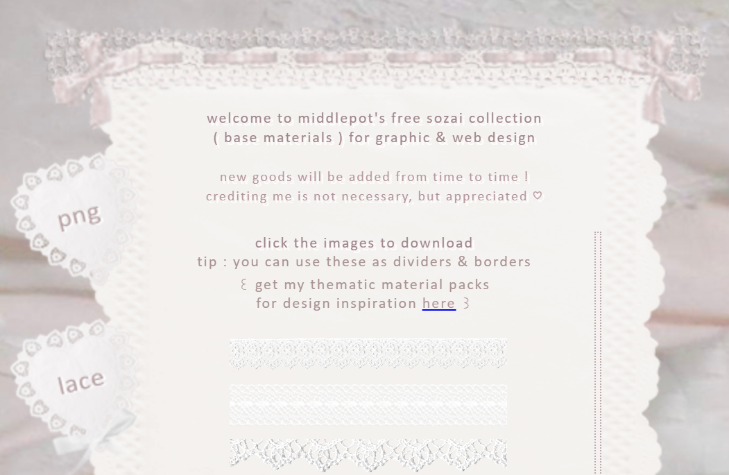
(1): icon sets from oh-bebe.net, 2004 (via Wayback Machine) (2): dividers from middlepot
sozai collections can still be found today on neocities.org sites and tumblrs. notably, many sozai collections have not adapted to modern screen resolutions, web capabilities, or visual trends. as a search of #sozai on tumblr illustrates, the word "sozai" has become, in the non-japanese-speaking world, at least, a term to encompass all dimunitive, pixelated, and sugary-sweet web graphics reminiscent of the 2000s. indeed, much of it is from 20 years ago and has been reposted from the original sources that are now largely offline. these sozai collections, while less functional for those building sites for modern devices, nonetheless provide historical and nostalgic value.

table layouts ☘ in the early 2000s, html and css offered few methods for placing images precisely, especially in relation to text. one common method for placing text inside a graphic container was by creating a 3 x 3 table layout. the center cell of the table contained the text, while the surrounding 8 cells each contained one small part of an image to create a border or outline. this method was used to great effect among webmistresses in the 2000s. navigation sections might appear to float on top of a smiling piece of toast or inside a glass jar of pixelated fairies, for example.
table layouts can be best illustrated by example. the link boxes that appear on this site are table layouts designed by evastars. what appears to be one graphic is actually several small graphics arranged in a table and tiled where needed. below is a replica of one of these tables, this time with the table borders drawn in purple.

|

|
|
content goes in the center cell |
||

|

|
though less common, table layouts were sometimes shared as sozai. evastars did so, producing many of their table layouts by ripping video game sprites.
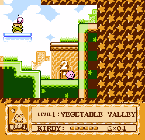
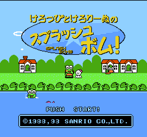
evastars ripped sprites from two 1990s video games to create this site's table layouts: kirby's adventure and keroppi to keroriinu no splash bomb
in subsequent years, css offered improved support for custom borders, background repeat rules, and positioning, so table layouts are rarely used today. the highly-graphic nature of table layouts pose a preservation challenge today, as images have not been preserved by crawlers as consistently as textual content.


 |
 |
|
~* evastars (me) *~interviewcurrently... y2k playlist tools + tech |
||
 |
 |
 |
 |
|
~* pfft (you) *~aboutgallery shop curatorial statement |
||
 |
 |
 |
 |
|
~* reference (site) *~art style + influencesgender + the me/you/site illustrated glossary link dump |
||
 |
 |
pfft is made possible with support from femicom museum and welcome to my homepage